Good shots, and why?
These two shots are the highlight for our opening title sequence, this is why.
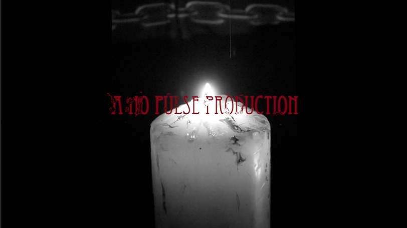
In the this shot under the, 'INSIDIOUS (EXAMPLE), you can slightly see (what is suppose to be blood) dripping from the candle, this shot we thought was a bit cliché, and most of what we put into our opening title sequences are too cliché. However in what appears to be a chains (These are not real chains, there just chains on Callum Kirby's jacket) in the background; that gives an effect of maybe the candle being in a dungeon or a forbidden place.. Now onto the topic of mise-en scene, starting with colour. The colour white represents goodness, purity and innocence; and a good example of this, in the image is the candle. The particular white candle is mostly used as a source of light in horror movies, with this candle not having much light in the room; meaning at any given time there could be something or someone in front of you, and all you can see is their face or a quarter of the object. Therefore, since the candle does not give much light, that would lead to why we could only see chains in the background and nothing more. We used a black background as not only to make our title and the candle stand out more, but we also used this colour as it signifies death, evil and mystery. The colour red we found to be effective in our title sequence, because not only does it represent blood, danger; but researches have found that this colour is emotionally intense and can raise blood pressure. Likewise, the colour blended better with black and white. We took this idea from the film 'INSIDIOUS'. As you can see in the shot of our production name, the camera angle is slightly out of the neutral view, and into the high angle. The purpose of that, is so the light can give our title more clarity, not only that; but the shot of this would not give the audience a feel of anything as we want them to feel calm and relaxed in the beginning, then during out opening title sequence, tension builds. We added the effect of water dripping on the titles as we felt that this would make the audience think some of the blood is dripping on the title.
In the this shot under the, 'INSIDIOUS (EXAMPLE), you can slightly see (what is suppose to be blood) dripping from the candle, this shot we thought was a bit cliché, and most of what we put into our opening title sequences are too cliché. However in what appears to be a chains (These are not real chains, there just chains on Callum Kirby's jacket) in the background; that gives an effect of maybe the candle being in a dungeon or a forbidden place.. Now onto the topic of mise-en scene, starting with colour. The colour white represents goodness, purity and innocence; and a good example of this, in the image is the candle. The particular white candle is mostly used as a source of light in horror movies, with this candle not having much light in the room; meaning at any given time there could be something or someone in front of you, and all you can see is their face or a quarter of the object. Therefore, since the candle does not give much light, that would lead to why we could only see chains in the background and nothing more. We used a black background as not only to make our title and the candle stand out more, but we also used this colour as it signifies death, evil and mystery. The colour red we found to be effective in our title sequence, because not only does it represent blood, danger; but researches have found that this colour is emotionally intense and can raise blood pressure. Likewise, the colour blended better with black and white. We took this idea from the film 'INSIDIOUS'. As you can see in the shot of our production name, the camera angle is slightly out of the neutral view, and into the high angle. The purpose of that, is so the light can give our title more clarity, not only that; but the shot of this would not give the audience a feel of anything as we want them to feel calm and relaxed in the beginning, then during out opening title sequence, tension builds. We added the effect of water dripping on the titles as we felt that this would make the audience think some of the blood is dripping on the title.
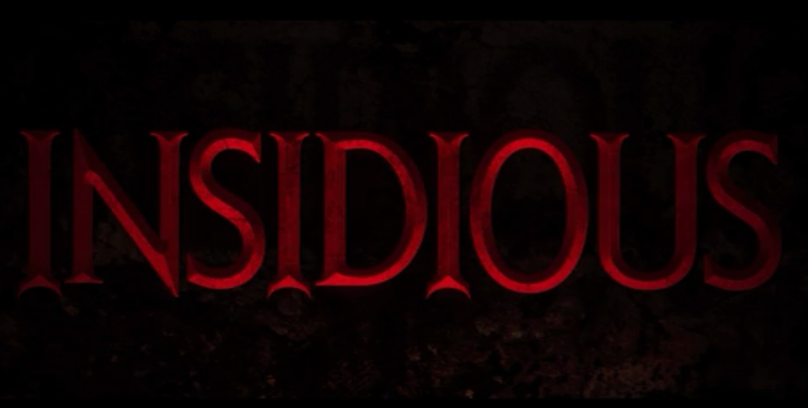
INSIDIOUS (EXAMPLE)
Shot of our opening title sequence; Production Name
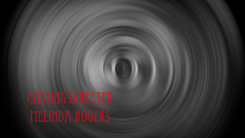
Shot of title; Casting Directer
In this other shot we also thought this would be another good highlight of our opening titles. In this shot you see a whirling effect and the name on the bottom left side of the screen. The reason for choosing this shot as our highlight is because, it gives the effect of confusion and almost engaging the audience; making them believe their going through this spiral of our world of 'SEANCE'.
Bad shots, and why?
Shot of title;
These two shots are the ones our group didn't think would engage the audience as we want. The purpose of this shot being a bad one is because not much is seen, which might turn the audience off. We understand they can be exceptions of not seeing much in a scene of a horror movie, so we made sure that the camera could focus back into the scene so the audience are fully aware of what is shown and what's happening in the scene.
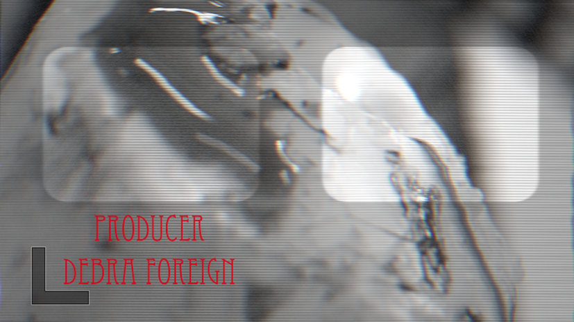
Shot of title; Producer
In this shot displays white squares and the effect 'Bad Effect'. The reason for why we thought this wasn't a good scene in out opening titles is because in all the other scenes of our opening titles this effect was used in the pictures we added to create a story (Linear filming). So since the scene of the candles was not included in 'our story' this effect would confuse the audience and look unprofessional.
